Be on the lookout for graph smoothing
Where did the traffic spikes go?
Take caution when using long term graphs for network capacity planning. In order to visualize historical interface trending information on a reasonably sized graph, the data needs to be averaged. This may smooth out important spikes that would otherwise indicate interface congestion.
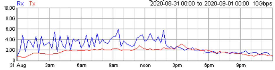
Looking at a 24 hour graph with 1 minute resolution, it is easy to spot 9Gb/s spikes throughout the day. The graph is a reasonable size and the data paints a good picture of an interface nearing a congestion problem:

When looking at 7 day historical information, many graphing systems automatically change the resolution to the appropriate average for the time period. In this example the average is 15 minutes. Compare the difference between 1 minute and 15 minute resolution. The 9Gb/s spikes dropped to less then 5Gb/s. When trying to determine link capacity issues, this is a large discrepancy:
The accuracy problem is resolved by changing the averaging back to 1 minute resolution. But, look what happens to the graph. The width changes from a few inches to over 140 inches. That is a lot of scrolling to the right:
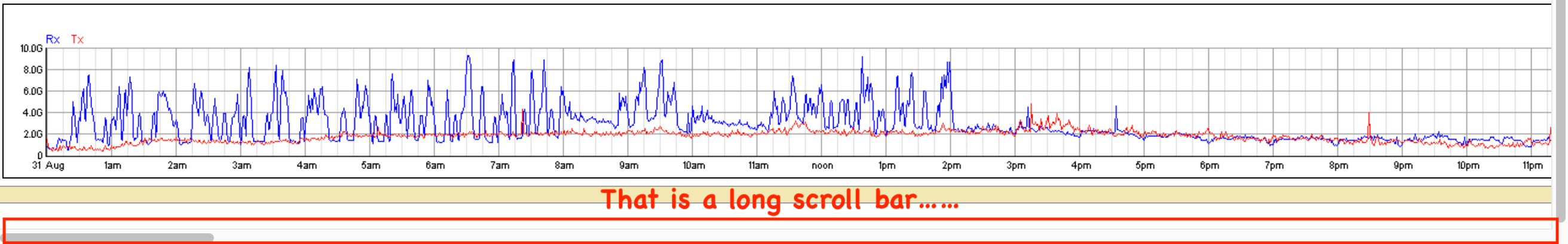
It is possible to “display” the data on a single screen, but good luck reading it:

Understanding how these tools present data will help drive accurate capacity planning.